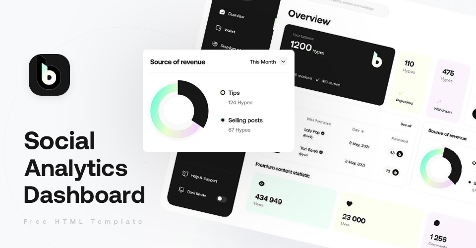
Developer: Mikhail Konin, Designer: Yehor Haiduk


- Fully CSS-Grid
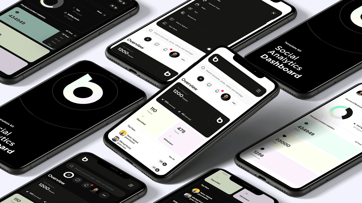
- Fully responsive
- Fully separate to components
- No require dependencies
- No JQuery
- All code based on BEM principles
- Sass
- Google Fonts
- Quick start from prepared workspace: 🗲🗲
- Husky - Pre-commit tests
- Commitlint - Conventional changelog commits linter
- Standard-version - Automatic Generate changelog from commits and create releases
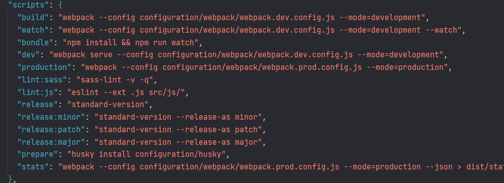
- Webpack and addons(Babel, Sass, loaders, minimizers, etc.)
- This template can be used as a base layer for any of your future projects
Use issue and follow the rules :)
The data from repository is provided an "As is", without any guarantees. All the data provided is used at your own risk. If you want report a bug - use issue

- General
- Quick start
- Workspace
- Template
- Scaffolding
- Contributing
- Buy Me A Coffee
- License and Changelog

If you need only compiled project:
- Clone this repository:
- Go to
Distfolder. - Enjoy this!
If you need full workspace:
- Clone this repository
- Check system requirements.
- Console or bash command for install package.json
cd html-social-analytics-dashboard-template
yarn install - Enjoy this!
if you do not have installed Yarn package manager:
npm install -g yarn, and repeat guide;
- NodeJS: 17.3 (My version at building time)
- Yarn: 1.22

package.jsoncontains shortcuts for most requirement operations
To simplify working environments and improve readability configuration -
webpack.config.jswill separate into 3 files, according building mode
New configs location: ./configuration/webpack/
| FileName ('.js') | Description |
|---|---|
environment |
Configuration for environment paths |
webpack.dev.config |
Configuration for developer bundle |
webpack.prod.config |
Configuration for production bundle |
Project using commitlint for automatic generation of CHANGELOG.md from your commits.
Use template: tag: run message for commits.
Allowed tags for commits:
- build
- chore
- ci
- docs
- feat
- fix
- perf
- refactor
- revert
- style
- test

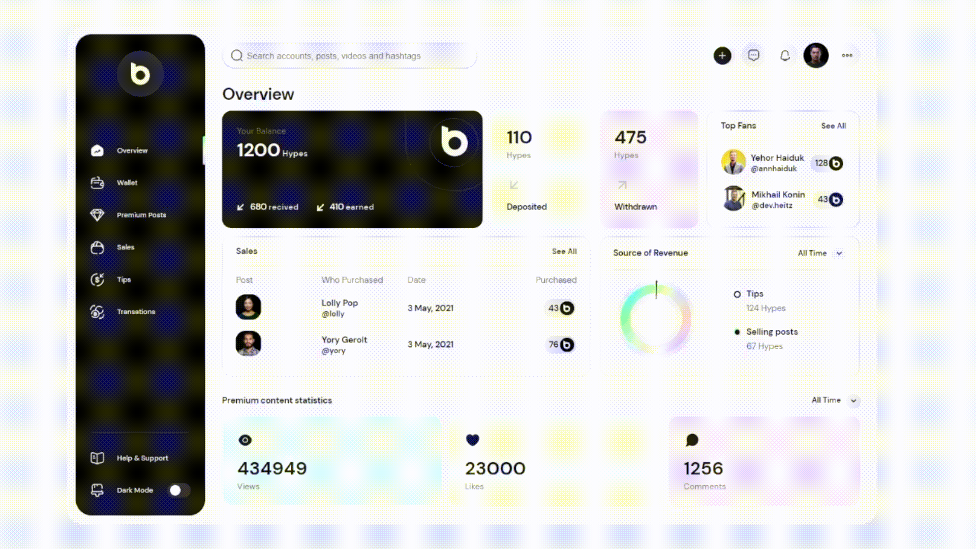
All project separated to components by BEM. You can
easy copy-paste any module into another project. Don't forget to replace color variables.
| Name | Description | Type |
|---|---|---|
| Select | Custom select dropdown list menu | JS - Component |
| Notifer | Small component for Notices | JS - Component |
| Toggle | Custom toggle switcher | JS - Component |
| Hamburger | Use as button-switcher mobile menu state | JS - Component |
| Counter Card | Display statistic | HTML/CSS |
| List | Use for list in another components | HTML/CSS |
| Logo | logo | HTML/CSS |
| Menu | Menu | HTML/CSS |
| Messages | Messages item in user-bar | HTML/CSS |
| More | More item in user-bar | HTML/CSS |
| New Action | New Action button item in user-bar | HTML/CSS |
| Profile | Profile picture item in user-bar | HTML/CSS |
| Page Heading | Page Title | HTML/CSS |
| Pie Chart | Diagram and legend styles | HTML/CSS |
| Search | Search box styles | HTML/CSS |
Set colors, fonts, sizes as you like when needed.
For get all customize variables go to ./src/config/
| Filename | Description |
|---|---|
colors.config.scss |
Full library with all colors used on this project |
typography.config.scss |
All for fonts. |
variables.config.scss |
Gaps, border radius, transition. |

.
├── .commitlintrc.json
├── .versionrc.json
├── babel.config.json
├── CHANGELOG.md
├── configuration
│   ├── husky
│   │   ├── commit-msg
│   │   ├── common.sh
│   │   └── pre-commit
│   └── webpack
│       ├── environment.js
│       ├── webpack.dev.config.js
│       └── webpack.prod.config.js
├── package.json
├── README.md
├── src
│   ├── assets
│   │   ├── css
│   │   │   └── main.scss
│   │   └── images
│   │       ├── branding
│   │       │   └── logo
│   │       │       ├── logo.png
│   │       │       ├── logo.svg
│   │       │       └── logo_stroked.svg
│   │       ├── favicon.ico
│   │       ├── icons
│   │       │   └── inbox.svg
│   │       └── thumbs
│   │           ├── posts
│   │           │   ├── loly.jpg
│   │           │   └── yory.jpg
│   │           └── users
│   │               ├── avatar.jpg
│   │               ├── mikhail.jpg
│   │               └── yehor.jpg
│   ├── components
│   │   ├── btn
│   │   │   └── btn.style.scss
│   │   ├── components.scss
│   │   ├── counter-card
│   │   │   ├── --darknes
│   │   │   │   └── counter-card--darkness.scss
│   │   │   ├── --primary
│   │   │   │   └── counter-card--primary.scss
│   │   │   ├── --rounded
│   │   │   │   └── counter-card--rounded.scss
│   │   │   ├── --secondary
│   │   │   │   └── counter-card--secondary.scss
│   │   │   ├── --tertiary
│   │   │   │   └── counter-card--tertiary.scss
│   │   │   ├── __count
│   │   │   │   ├── --balance
│   │   │   │   │   └── counter-card__count--balance.scss
│   │   │   │   ├── --has-label
│   │   │   │   │   └── counter-card__count--label.scss
│   │   │   │   ├── --size
│   │   │   │   │   └── counter-card__count--size.scss
│   │   │   │   └── counter-card__count.scss
│   │   │   ├── __footer
│   │   │   │   └── counter-card__footer.scss
│   │   │   ├── __head
│   │   │   │   └── counter-card__head.scss
│   │   │   ├── __icon
│   │   │   │   └── counter-card__icon.scss
│   │   │   ├── __link
│   │   │   │   └── counter-card__link.scss
│   │   │   ├── __list-item
│   │   │   │   ├── --icon
│   │   │   │   │   └── counter-card__list-item--icon.scss
│   │   │   │   └── counter-card__list-item.scss
│   │   │   ├── __list
│   │   │   │   ├── --horizontal
│   │   │   │   │   └── counter-card__list--horizontal.scss
│   │   │   │   └── counter-card__list.scss
│   │   │   ├── __logo
│   │   │   │   ├── --has-overlay
│   │   │   │   │   └── counter-card__logo--has-overlay.scss
│   │   │   │   └── counter-card__logo.scss
│   │   │   └── counter-card.style.scss
│   │   ├── hamburger
│   │   │   ├── --active
│   │   │   │   └── hamburger--active.scss
│   │   │   ├── __line
│   │   │   │   ├── --bottom
│   │   │   │   │   └── hamburger__line--bottom.scss
│   │   │   │   ├── --top
│   │   │   │   │   └── hamburger__line--top.scss
│   │   │   │   └── hamburger__line.scss
│   │   │   ├── __svg
│   │   │   │   └── hamburger__svg.scss
│   │   │   ├── hamburger.component.js
│   │   │   └── hamburger.style.scss
│   │   ├── list
│   │   │   ├── __brand-box
│   │   │   │   └── list__brand-box.scss
│   │   │   ├── __cell
│   │   │   │   ├── --wide
│   │   │   │   │   └── list__cell--wide.scss
│   │   │   │   └── list__cell.scss
│   │   │   ├── __counter
│   │   │   │   └── list__counter.scss
│   │   │   ├── __date
│   │   │   │   └── list__date.scss
│   │   │   ├── __item
│   │   │   │   └── list__item.scss
│   │   │   ├── __logo
│   │   │   │   └── list__logo.scss
│   │   │   ├── __picture
│   │   │   │   ├── --round
│   │   │   │   │   ├── list__picture--round.scss
│   │   │   │   │   └── list__picture--round_sm.scss
│   │   │   │   └── list__picture.scss
│   │   │   ├── __userlink
│   │   │   │   └── list__userlink.scss
│   │   │   └── list.styles.scss
│   │   ├── logo
│   │   │   ├── __picture
│   │   │   │   └── logo__picture.scss
│   │   │   └── logo.style.scss
│   │   ├── menu
│   │   │   ├── __icon
│   │   │   │   └── menu__icon.scss
│   │   │   ├── __item
│   │   │   │   └── menu__item.scss
│   │   │   ├── __link
│   │   │   │   ├── --active
│   │   │   │   │   └── menu--active.scss
│   │   │   │   └── menu__link.scss
│   │   │   ├── __name
│   │   │   │   └── menu__name.scss
│   │   │   ├── __svg
│   │   │   │   └── menu__svg.scss
│   │   │   └── menu.style.scss
│   │   ├── messages
│   │   │   ├── __icon
│   │   │   │   └── messages__icon.scss
│   │   │   ├── __ticker
│   │   │   │   └── messages__ticker.scss
│   │   │   └── messages.style.scss
│   │   ├── more
│   │   │   ├── __icon
│   │   │   │   └── more__icon.scss
│   │   │   └── more.style.scss
│   │   ├── new-action
│   │   │   ├── __icon
│   │   │   │   └── _new-action__icon.scss
│   │   │   ├── __wrapper
│   │   │   │   └── _new-action__wrapper.scss
│   │   │   └── new-action.style.scss
│   │   ├── notifer
│   │   │   ├── --active
│   │   │   │   └── notifier--active.scss
│   │   │   ├── __icon
│   │   │   │   └── _notifier__icon.scss
│   │   │   ├── __ticker
│   │   │   │   └── notifier__ticker.scss
│   │   │   ├── notifier.component.js
│   │   │   └── notifier.style.scss
│   │   ├── page-heading
│   │   │   ├── __title
│   │   │   │   └── page-heading__title.scss
│   │   │   └── page-heading.style.scss
│   │   ├── pie-chart
│   │   │   ├── __circle
│   │   │   │   ├── --negative
│   │   │   │   │   └── pie-chart__circle--negative.scss
│   │   │   │   └── pie-chart__circle.scss
│   │   │   ├── __legend-item-identifier
│   │   │   │   ├── --pure
│   │   │   │   │   └── pie-chart__legend-item-identifier--pure.scss
│   │   │   │   └── pie-chart__legend-item-identifier.scss
│   │   │   ├── __legend-item-name
│   │   │   │   └── pie-chart__legend-item-name.scss
│   │   │   ├── __legend-item-value
│   │   │   │   └── pie-chart__legend-item-value.scss
│   │   │   ├── __legend-item
│   │   │   │   └── pie-chart__legend-item.scss
│   │   │   ├── __legend
│   │   │   │   └── pie-chart__legend.scss
│   │   │   └── pie-chart.style.scss
│   │   ├── profile
│   │   │   └── _profile.style.scss
│   │   ├── search
│   │   │   ├── __icon-svg
│   │   │   │   └── search__icon-svg.scss
│   │   │   ├── __icon
│   │   │   │   └── search__icon.scss
│   │   │   ├── __input
│   │   │   │   └── search__input.scss
│   │   │   └── search.style..scss
│   │   ├── select
│   │   │   ├── --show
│   │   │   │   └── select--show.scss
│   │   │   ├── __dropdown
│   │   │   │   └── _select__dropdown.scss
│   │   │   ├── __option
│   │   │   │   └── _select__option.scss
│   │   │   ├── __options
│   │   │   │   └── _select__options.scss
│   │   │   ├── __toggle
│   │   │   │   └── select__toggle.scss
│   │   │   ├── select.component.js
│   │   │   └── select.style.scss
│   │   ├── toggle
│   │   │   ├── toggle.component.js
│   │   │   └── toggle.style.scss
│   │   └── widget
│   │       ├── --border
│   │       │   └── _border.scss
│   │       ├── --gap
│   │       │   └── _gap.scss
│   │       ├── --size
│   │       │   └── _size.scss
│   │       ├── __content
│   │       │   ├── --extra-col
│   │       │   │   └── _extra-col.scss
│   │       │   └── _content.scss
│   │       ├── __more-link
│   │       │   └── widget__more-link.scss
│   │       ├── __separator
│   │       │   └── _separator.scss
│   │       ├── __title
│   │       │   └── _title.scss
│   │       ├── __toolbar
│   │       │   └── _toolbar.scss
│   │       └── widget.style.scss
│   ├── config
│   │   ├── colors.config.scss
│   │   ├── mixins
│   │   │   ├── _animations.scss
│   │   │   ├── _border-styles.scss
│   │   │   ├── _box-shadows.scss
│   │   │   ├── _breakpoints.scss
│   │   │   ├── _gradient.scss
│   │   │   └── mixins.scss
│   │   ├── typography.config.scss
│   │   └── variables.config.scss
│   ├── entry-points.js
│   ├── helpers
│   │   └── mobileMenuSwitchState.js
│   ├── index.html
│   ├── index.js
│   ├── layouts
│   │   ├── app
│   │   │   └── app.scss
│   │   ├── container
│   │   │   ├── --gap
│   │   │   │   ├── --lg
│   │   │   │   │   └── container--gap--lg.scss
│   │   │   │   └── container--gap.scss
│   │   │   └── container.scss
│   │   ├── grid
│   │   │   ├── --main
│   │   │   │   └── grid--main.scss
│   │   │   ├── --toolbar
│   │   │   │   └── grid--toolbar.scss
│   │   │   ├── --widgets_area
│   │   │   │   └── grid--widgets-area.scss
│   │   │   ├── __col
│   │   │   │   └── grid__col.scss
│   │   │   └── grid.scss
│   │   ├── layouts.scss
│   │   ├── sidebar
│   │   │   ├── __footer-nav
│   │   │   │   └── sidebar__footer-nav.scss
│   │   │   ├── __hamburger
│   │   │   │   └── sidebar__hamburger.scss
│   │   │   ├── __item
│   │   │   │   └── sidebar__item.scss
│   │   │   ├── __logo
│   │   │   │   └── sidebar__logo.scss
│   │   │   ├── __main-nav
│   │   │   │   ├── menu
│   │   │   │   │   ├── __link
│   │   │   │   │   │   ├── --active
│   │   │   │   │   │   │   └── menu__link--active.scss
│   │   │   │   │   │   └── menu__link.scss
│   │   │   │   │   └── menu.scss
│   │   │   │   └── sidebar__main-nav.scss
│   │   │   └── sidebar.scss
│   │   ├── user-bar
│   │   │   ├── --mobile-float
│   │   │   │   ├── --center
│   │   │   │   │   └── user-bar--mobile-float--center.scss
│   │   │   │   ├── --left
│   │   │   │   │   └── user-bar--mobile-float--left.scss
│   │   │   │   ├── --right
│   │   │   │   │   └── user-bar--mobile-float--right.scss
│   │   │   │   └── user-bar--mobile-float.scss
│   │   │   ├── --pc-float
│   │   │   │   ├── --center
│   │   │   │   │   └── user-bar--pc-float--center.scss
│   │   │   │   ├── --left
│   │   │   │   │   └── user-bar--pc-float--left.scss
│   │   │   │   ├── --right
│   │   │   │   │   └── user-bar--pc-float--right.scss
│   │   │   │   └── user-bar--pc-float.scss
│   │   │   ├── __item
│   │   │   │   └── user-bar__item.scss
│   │   │   └── user-bar.scss
│   │   └── wrapper
│   │       └── wrapper.scss
│   └── theme
│       ├── theme-dark
│       │   └── _theme-dark.scss
│       ├── theme-light
│       │   └── _theme-light.scss
│       └── theme.scss
├── webpack.config.js

I am <3 contributions big or small. If you help my project --> 🍰link to your profile will be here🍰.

Currently I'm seeking for new sponsors to help maintain this project! ❤️
With every donation you make - you're helping with development of this project. You will be also featured in project's README.md, so everyone will see your contribution and visit your content⭐.


Copyright (c) 2022, Mikahil Konin & Yehor Haiduk. This project under MIT license. See the changes in the CHANGELOG.md file.