You signed in with another tab or window. Reload to refresh your session.You signed out in another tab or window. Reload to refresh your session.You switched accounts on another tab or window. Reload to refresh your session.Dismiss alert
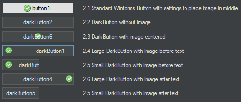
When adding an image to a dark button and placing it either before or after text the spacing between the text and image is very large and cannot be adjusted properly. There is a property called ImagePadding whose description says that it adjusts the padding between the image and text, but when changed seems to move the image and text away from the edge of the button while keeping the spacing between the image and button the same.
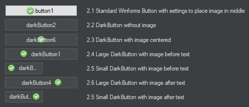
In light of this, I had a look at the source code and made some changes to the DarkButton to make the button function more like the standard winforms Button, as well as making the ImagePadding property adjust the space between the image and text.
Below are before and after images, as well as the changed code. The code changes were only done to the OnPaint function and all changes occur after the comment:
// =========== CHANGES FROM HERE ONWARDS ============
I don't know if what I have done was the intended way for the button to display (or was the icon always meant to stick to either the left or right edge of the button?). But use the code if it is helpful.
Current DarkButton:
Padding Changes with Current DarkButton. Left button has a padding of 5 and right button has a padding of 20:
DarkButton with Changes as per Code Below:
Padding Changes with DarkButton as per Code Below. Left button has a padding of 5 and right button has a padding of 20:
        protected override void OnPaint(PaintEventArgs e)
        {
            var g = e.Graphics;
            var rect = new Rectangle(0, 0, ClientSize.Width, ClientSize.Height);

            var textColor = Colors.LightText;
            var borderColor = Colors.GreySelection;
            var fillColor = _isDefault ? Colors.DarkBlueBackground : Colors.LightBackground;

            if (Enabled)
            {
                if (ButtonStyle == DarkButtonStyle.Normal)
                {
                    if (Focused && TabStop)
                        borderColor = Colors.BlueHighlight;

                    switch (ButtonState)
                    {
                        case DarkControlState.Hover:
                            fillColor = _isDefault ? Colors.BlueBackground : Colors.LighterBackground;
                            break;
                        case DarkControlState.Pressed:
                            fillColor = _isDefault ? Colors.DarkBackground : Colors.DarkBackground;
                            break;
                    }
                }
                else if (ButtonStyle == DarkButtonStyle.Flat)
                {
                    switch (ButtonState)
                    {
                        case DarkControlState.Normal:
                            fillColor = Colors.GreyBackground;
                            break;
                        case DarkControlState.Hover:
                            fillColor = Colors.MediumBackground;
                            break;
                        case DarkControlState.Pressed:
                            fillColor = Colors.DarkBackground;
                            break;
                    }
                }
            }
            else
            {
                textColor = Colors.DisabledText;
                fillColor = Colors.DarkGreySelection;
            }

            using (var b = new SolidBrush(fillColor))
            {
                g.FillRectangle(b, rect);
            }

            if (ButtonStyle == DarkButtonStyle.Normal)
            {
                using (var p = new Pen(borderColor, 1))
                {
                    var modRect = new Rectangle(rect.Left, rect.Top, rect.Width - 1, rect.Height - 1);

                    g.DrawRectangle(p, modRect);
                }
            }

            // =========== CHANGES FROM HERE ONWARDS ============

            var textOffsetX = 0;
            var textOffsetXRight = 0;
            var textOffsetY = 0;
            var horizontalAlignment = StringAlignment.Center;

            if (Image != null)
            {
                var x = (ClientSize.Width / 2) - (Image.Size.Width / 2);
                var y = (ClientSize.Height / 2) - (Image.Size.Height / 2);
                var stringSize = g.MeasureString(Text, Font, rect.Size);
                int extraSpace = 0;

                switch (TextImageRelation)
                {
                    case TextImageRelation.ImageAboveText:
                        textOffsetY = (Image.Size.Height / 2) + (ImagePadding / 2);
                        y = y - ((int)(stringSize.Height / 2) + (ImagePadding / 2));
                        break;
                    case TextImageRelation.TextAboveImage:
                        textOffsetY = ((Image.Size.Height / 2) + (ImagePadding / 2)) * -1;
                        y = y + ((int)(stringSize.Height / 2) + (ImagePadding / 2));
                        break;
                    case TextImageRelation.ImageBeforeText:
                        extraSpace = Math.Max(0, rect.Width - ((int)stringSize.Width + Image.Size.Width + Padding.Horizontal + ImagePadding));
                        textOffsetX = extraSpace / 2 + Image.Size.Width + ImagePadding;
                        x = Padding.Left + extraSpace / 2;
                        horizontalAlignment = StringAlignment.Near;
                        break;
                    case TextImageRelation.TextBeforeImage:
                        extraSpace = Math.Max(0, rect.Width - ((int)stringSize.Width + Image.Size.Width + Padding.Horizontal + ImagePadding));
                        textOffsetXRight = extraSpace / 2 + Image.Width + ImagePadding;
                        x = rect.Width - (Padding.Right + Image.Width + extraSpace / 2);
                        horizontalAlignment = StringAlignment.Far;
                        break;
                }

                g.DrawImageUnscaled(Image, x, y);
            }

            using (var b = new SolidBrush(textColor))
            {
                var modRect = new Rectangle(rect.Left + textOffsetX + Padding.Left,
                                             rect.Top + textOffsetY + Padding.Top,
                                             rect.Width - (Padding.Horizontal + textOffsetX + textOffsetXRight),
                                             rect.Height - Padding.Vertical);

                var stringFormat = new StringFormat
                {
                    LineAlignment = StringAlignment.Center,
                    Alignment = horizontalAlignment,
                    Trimming = StringTrimming.EllipsisCharacter
                };

                g.DrawString(Text, Font, b, modRect, stringFormat);
            }
        }
The text was updated successfully, but these errors were encountered:
When adding an image to a dark button and placing it either before or after text the spacing between the text and image is very large and cannot be adjusted properly. There is a property called ImagePadding whose description says that it adjusts the padding between the image and text, but when changed seems to move the image and text away from the edge of the button while keeping the spacing between the image and button the same.
In light of this, I had a look at the source code and made some changes to the DarkButton to make the button function more like the standard winforms Button, as well as making the ImagePadding property adjust the space between the image and text.
Below are before and after images, as well as the changed code. The code changes were only done to the OnPaint function and all changes occur after the comment:
// =========== CHANGES FROM HERE ONWARDS ============
I don't know if what I have done was the intended way for the button to display (or was the icon always meant to stick to either the left or right edge of the button?). But use the code if it is helpful.
Current DarkButton:

Padding Changes with Current DarkButton. Left button has a padding of 5 and right button has a padding of 20:

DarkButton with Changes as per Code Below:

Padding Changes with DarkButton as per Code Below. Left button has a padding of 5 and right button has a padding of 20:

The text was updated successfully, but these errors were encountered: