Skip to content
New issue

Have a question about this project? Sign up for a free GitHub account to open an issue and contact its maintainers and the community.

By clicking “Sign up for GitHub”, you agree to our terms of service and privacy statement. We’ll occasionally send you account related emails.

Already on GitHub? Sign in to your account

Graphical representation for the users #51

Open
lionelkusch opened this issue Dec 10, 2024 · 23 comments
Open

Graphical representation for the users #51

lionelkusch opened this issue Dec 10, 2024 · 23 comments
Labels
examples Question link to the examples

Comments

@lionelkusch
Copy link
Collaborator

My summarise of the discussion with @AngelReyero and @jpaillard:
For basic users:

  • showing the importance of features or a group of features ( horizontal line with a point at the end). Only the most important due to the high dimension
  • showing the distribution of the importance ( use box plot and/or violin plot)
  • showing the data ( need to be adjusted with the type of data)
  • showing the correlation of features (correlation plot with an order based on a clustering for highlight blocks of correlations)

For more advanced users: (not yet finalised)

  • comparison of the different methods (a bar plot, or box plot)
@lionelkusch
Copy link
Collaborator Author

Add graphics for "simple" linear dependence between variables.

@lionelkusch lionelkusch added the examples Question link to the examples label Dec 18, 2024
@lionelkusch
Copy link
Collaborator Author

@bthirion
Copy link
Contributor

We need to investigate whether this library indeed solves PDP, in which case we should reuse it rather than reimplement.

@lionelkusch
Copy link
Collaborator Author

Do you want to include PDP as a model in the library?

@lionelkusch
Copy link
Collaborator Author

I find that scikit-learn has already implemented it but their graphical representation is quite limited.

@bthirion
Copy link
Contributor

We should start with a nice graphical example showcasing it. Note that you should talk to the sklearn team (e.g. @glemaitre ), they want to rework the variable importance part.

@lionelkusch
Copy link
Collaborator Author

@glemaitre
Copy link

I find that scikit-learn has already implemented it but their graphical representation is quite limited.

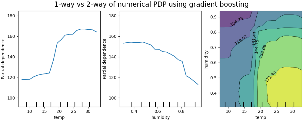
Currently, for the partial dependence we have a graphical representation that show the average and option to show the individual line and also a bar plot representation for categorical variable.

@lionelkusch I'm wondering which graphical representation would you suggest to add. I think that we have more or less the one presented in Christopher Molnar book.

We should start with a nice graphical example showcasing it. Note that you should talk to the sklearn team (e.g. @glemaitre ), they want to rework the variable importance part.

When it comes to a broader scope regarding variable importance, we indeed want to add or rework some part of scikit-learn:

  • With the help of the CZI grant, we aim at improving displays by adding missing defacto visualization:
    • Extending the displays and add a .from_cv_results method. This method should take an ensemble of models (obtained by cross-validation) and show somewhat the distributions of the desired information (e.g. multiple ROC curves).
    • Having standard visualization that are now missing in scikit-learn. For instance, the variable importance could be one of them to show the feature_importances_ or coef_ visualization. If using the previous item on cross-validation, we can have distribution of those.
  • Also within the CZI scope, we intend to rework/extend the variable importance scope: there is no single methods that shine out there and our current implementation exposing a variable feature_importances_ is misleading. We would like to come with a more generic function/method such that given a model, you can compute the desired importance and being aware of the limitation. So this one is a bit more long term but I'm happy to discuss because it can inform our design (a draft of some potential avenues: SLEP021: Unified API for computing feature importance scikit-learn/enhancement_proposals#86)

@lionelkusch
Copy link
Collaborator Author

image
On our graphical representation, I didn't notice the data distribution on the x-axis, the first time that I saw it.
For the 2D, the distribution of the data is only on the x-axis, and it should be on the y-axis also.
For improving, you can change the colour of the distribution of the dataset or add a space with the x-axis because it can be confused with the bar for the ticks. For a 2D plot, if you can add a white rectangular under it, the distribution will be more readable.

Another possibility is, instead, to plot each point of the dataset; it's to plot the histogram. You can find some examples in the library shap:
image

I found another library, which proposes a more complex representation but I like it. [alePython][https://github.com/blent-ai/ALEPython]
It includes the quartile on the top and on the right of the data distribution. However, it can be too much information on the same graphic.
image

@glemaitre
Copy link

Thanks for the example, I see what you mean now.

We need to go back to the following PR but I think that it partially address some the first remarks: scikit-learn/scikit-learn#27388.

Maybe merging the quantile information on the marginal plot would be a way that:

  • we don't confuse it with the x- or y-axis
  • and we are explicit on what are those ticks

@lionelkusch
Copy link
Collaborator Author

@glemaitre
I have consulted the pull request, SLEP021. I have a few questions, probably because I'm new to the topic of variable importance and I'm not familiar with the development of scikit-learn.

As I understand it, feature_importances_ is only implemented for trees, based on Gini importance.
Why not rename feature_importances_ to gini_importances_?

If you want to generalize feature_importances_ to all models, from my point of view, it's not possible because some models don't have a human-understandable way of handling data, such as nonlinear models or high-dimensional predictor models. If we use the definition that feature importance provides a measure of the impact of a feature on the mean prediction of an estimator. In this case, extracting feature importance is non-trivial, as some features do not have a constant overall effect (especially with non-linear models) that may be difficult to summarize by a value. In addition, there is a trade-off between the importance of a variable in a sub-domain of the data and its overall importance, which is quite complex to induce.

@glemaitre
Copy link

As I understand it, feature_importances_ is only implemented for trees, based on Gini importance.
Why not rename feature_importances_ to gini_importances_?

It is criterion agnostic, meaning if you use entropy, it will be based on this criterion. Basically it is called mean decrease in impurity (MDI) and so a more generic name. If we go with a renaming, then we need to take the opportunity to be able to compute different importances and not provide a single one (furthermore on the training set only).

If you want to generalize feature_importances_ to all models

Actually, we want to go against generalizing. We think that there is not one suitable for all models. However, we want to provide a common programmatic entry point for those methods such that are user can choose. For instance, the API should be enough flexible to let our user choose between the MDI or permutation importance (or SHAP) and we should not choose a feature_importance_ for them if there is no "good" choice.

@lionelkusch
Copy link
Collaborator Author

We just started a discussion on the API for library in this issue #104. If you follow the conversation, it will probably give you some additional hints.

@lionelkusch
Copy link
Collaborator Author

It can be interesting to include graphic like Manhattan plot: https://en.wikipedia.org/wiki/Manhattan_plot

@bthirion
Copy link
Contributor

bthirion commented Jan 8, 2025

This corresponds to marginal tests, but you're right this is part of the picture.

@lionelkusch
Copy link
Collaborator Author

@bthirion
Copy link
Contributor

Nice indeed.

@lionelkusch
Copy link
Collaborator Author

This is nice paper on representation for representing the result: https://arxiv.org/pdf/1610.00290

@lionelkusch
Copy link
Collaborator Author

I found this library in R which is specialised in representations of variables of importance: https://alaninglis.github.io/vivid/articles/vividVignette.html
I like their generalised partial dependence pairs plot but I don't think that it's adapted to high-dimensional data.

@lionelkusch
Copy link
Collaborator Author

I found an example of PDP based on alluvial plots and with interactive examples: https://github.com/erblast/easyalluvial#partial-dependence-alluvial-plots
This can be an idea for representing results where the group of variables is present.

@lionelkusch
Copy link
Collaborator Author

An other way is to use Parallel Coordinate Plot: https://github.com/simonpradel/visualize-hyperparameter

@bthirion
Copy link
Contributor

I think it does not scale really well when you increase the #variables...

Sign up for free to join this conversation on GitHub. Already have an account? Sign in to comment
Labels
examples Question link to the examples
Projects
None yet
Development

No branches or pull requests

3 participants