可视化设计器(体积很大,注意流量,最好用PC打开) https://miku01.cn/taroifyDesignable/index.html
demo H5(按 F12 切换设备仿真) https://miku01.cn/taroifyDemo/index.html#/pages/index/index
组件化搭建领域抽象的最好的搭建引擎,与formily同样的配方,不同的只是解决的不同问题,作为底层搭建引擎,它该有的能力都有,最基础的拖拽,就支持了很多形态的,比如,多选拖拽,跨区域拖拽,跨工作区拖拽,跨iframe拖拽,还有多选,快捷键多选,shift/ctrl加点击交集化多选,还有基于鼠标形态切换的选区式多选,再说说扩展性,它本身内核是一个框架无关的内核,只负责管理模型状态,然后我们想要扩展ui的话,只需要替换ui组件即可,designable本身提供了一系列开箱即用的ui组件,且是绝对遵循组合模式的方案,不搞黑盒插件模式,你想用就用它,不想用就替换它,因为组件本身是无状态的,状态都在内核中管理,所以这就使得了designable的扩展性,极其的强
如上 designable 开源库作者所述,designable 是一个设计器引擎,提供拖拽搭建能力。
我们可以用它来往上层封装出具体产品,比如表单设计器、低代码平台。
formily表单设计器,就是基于designable扩展出来的。
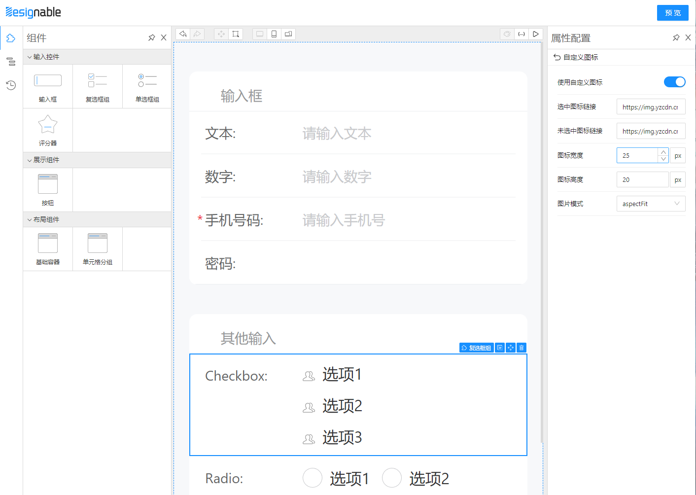
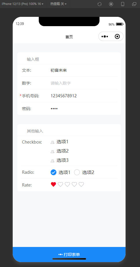
这是预览地址, 颜值非常得高


平时我的工作任务主要小程序开发,接下来文章会去介绍怎么开发 Taro小程序前端页面可视化搭建工具
- 目前 designable 1.x版本非稳定正式版本,2.0 版本可能要2022年7月中旬发布alibaba/designable#240
- 目前没有文档,可以先看一些非官方文章或视频教程
- 表单设计器开发指南
- 「表单设计器开发指南」的内容补充*
- Designable 应用和源码浅析
- Formily实践(1.x)
- formily+vue3 组件桥接和具名插槽使用的两种方法
- 低代码入门介绍
- 低代码渲染那些事
- 从实现原理看低代码
首先厘清一下本文的开发范围。一般市面上推出的低代码产品会包含 界面可视化搭建、后端数据存储、应用管理发布等功能,偏向零代码方案面向非开发者;但如 lowcode-engine 阿里低代码引擎文档中所说,低代码本身也不仅仅是为技术小白准备的。在实践中,低代码因为通过组件化、模块化的思路让业务的抽象更加容易,而且在扩展及配置化上带来了更加新鲜的模式探索,技术人员的架构设计成本和实施成本也就降了很多。作为前端开发者,我们接下来先重点关注 web前端页面可视化搭建 如何开发。
低代码渲染有一个简单的公式

按这个公式的理解,可视化搭建中有三个角色
组件库。前端展示组件,不利用 JSONSchema 也可以像antd一样普通的用代码展示出来。协议和渲染器。渲染器根据协议解析 JSONSchema 最终展示出组件。可视化设计器。基于渲染器展示界面,加入拖拽和配置能力,高效产出 JSONSchema。
可以说 组件库 和 渲染器 是基础,有了这两消费端已经可以进行渲染了,可视化设计器 是锦上添花。
渲染器 大概要做以下内容:
- 获取源码组件
- 解析组件的 props
- 获取组件的 children
- 保留并传入上下文,包括循环上下文,插槽上下文等;
- 节点更新,当参数变化时需要更新对应的节点
formily表单设计器 约等于 使用了antd组件的可视化设计器,我们先了解一下大致是怎么实现的
designable 本身只提供拖拉拽等能力,协议、渲染器 主要依赖 formily表单解决方案 的协议驱动能力(标准JSON-Schema)

组件适配协议,要基于@formily的api进行改造,适配协议后好处就是我们可以依赖 Formily MVVM的能力,不止可以渲染页面,还可以低成本地 支配 页面,如 表单校验、异步数据源、页面联动逻辑,最简单的例子是根据用户行为决定一个组件的显示和隐藏,就这么一个简单的需求很多低代码产品都不支持。
怎么接入可以参考@formily/antd
如果是使用第三方组件库,那么根据主框架是 react 或者 vue 可以分别用 @formily/react / @formily/vue UI桥接层。

例如接入 antd 的 Form.Item,使用 connnet api去把组件"连接"到 formily。mapProps api可以映射组件的属性字段,mapProps 提供的 field 包含着 Field模型属性,例如字段的值、是否可编辑、是否非法等表单属性,我们可以取出来作为组件的 props
import React, { useMemo } from 'react'
import { createForm } from '@formily/core'
import {
  FormProvider,
  FormConsumer,
  Field,
  connect,
  mapProps,
} from '@formily/react'
import { Input, Form, Button } from 'antd'

// FormItem UI组件
const FormItem = connect(
  Form.Item,
  mapProps(
    {
      title: 'label',
      description: 'extra',
      required: true,
      validateStatus: true,
    },
    (props, field) => {
      return {
        ...props,
        help: field.selfErrors?.length ? field.selfErrors : undefined,
      }
    }
  )
)
接入 antd 的 Input 组件,别看代码里面没做什么属性映射,实际上是 formily 的 Field模型与 AntdInput 已经对齐了 values、disabled 等核心表单属性,并且在设计器上配置的 style、maxLength 等属性是可以透传的。
import React from 'react'
import { connect, mapProps, mapReadPretty } from '@formily/react'
import { Input as AntdInput } from 'antd'
import { InputProps, TextAreaProps } from 'antd/lib/input'
import { PreviewText } from '../preview-text'
import { LoadingOutlined } from '@ant-design/icons'

type ComposedInput = React.FC<React.PropsWithChildren<InputProps>> & {
  TextArea?: React.FC<React.PropsWithChildren<TextAreaProps>>
}

export const Input: ComposedInput = connect(
  AntdInput,
  mapProps((props, field) => {
    return {
      ...props,
      suffix: (
        <span>
          {field?.['loading'] || field?.['validating'] ? (
            <LoadingOutlined />
          ) : (
            props.suffix
          )}
        </span>
      ),
    }
  }),
  mapReadPretty(PreviewText.Input)
)

Input.TextArea = connect(AntdInput.TextArea, mapReadPretty(PreviewText.Input))

export default Input给组件添加行为,大致就是描述一下组件有哪些属性需要在 设计器 上配置的,可以配置哪些内容,还有 设计器 与组件的交互,例如点击、拖拉这个组件会有什么反应。
给组件添加资源,简单的理解就是添加一些在 设计器 展示的内容,比如需要展示在左边组件区,那就需要一个icon

有了这些配置,组件就变成了 低代码物料
例如 antd 的 Input 物料
import React from 'react'
import { Input as FormilyInput } from '@formily/antd'
import { createBehavior, createResource } from '@designable/core'
import { DnFC } from '@designable/react'
import { createFieldSchema } from '../Field'
import { AllSchemas } from '../../schemas'
import { AllLocales } from '../../locales'

// 组件模版,这部分可以写的很复杂
export const CustomComponent: DnFC = ({ ...props }) => {
  // props对应Resource的x-component-props
  return (
    <div>
      {/* 也可以以高级组件的形式使用:{props.children}*/}
      <input type="text" {...props} />
    </div>
  );
};

export const Input: DnFC<React.ComponentProps<typeof FormilyInput>> =
  FormilyInput

Input.Behavior = createBehavior(
  {
    name: 'Input', // 物料名字
    extends: ['Field'], // 继承 Field模型 行为
    selector: (node) => node.props['x-component'] === 'Input', // 选择到该物料的条件 与Resource的x-component的值匹配上才生效
    designerProps: {
      // 需要进行配置的属性 例如输入框的 maxLength、placeholder 等
      // createFieldSchema的值如果是空对象,则“属性配置”面板中没有“组件属性”。
      // 如果把createFieldSchema换成createVoidFieldSchema函数,字段属性一栏将只保留必要的配置项。
      propsSchema: createFieldSchema({
        type: 'object',
        properties: {
          addonBefore: {
            type: 'string',
            'x-decorator': 'FormItem',
            'x-component': 'Input',
          },
          addonAfter: {
            type: 'string',
            'x-decorator': 'FormItem',
            'x-component': 'Input',
          },
          prefix: {
            type: 'string',
            'x-decorator': 'FormItem',
            'x-component': 'Input',
          },
          suffix: {
            type: 'string',
            'x-decorator': 'FormItem',
            'x-component': 'Input',
          },
          allowClear: {
            type: 'boolean',
            'x-decorator': 'FormItem',
            'x-component': 'Switch',
          },
          bordered: {
            type: 'boolean',
            'x-decorator': 'FormItem',
            'x-component': 'Switch',
            'x-component-props': {
              defaultChecked: true,
            },
          },
          maxLength: {
            type: 'number',
            'x-decorator': 'FormItem',
            'x-component': 'NumberPicker',
          },
          placeholder: {
            type: 'string',
            'x-decorator': 'FormItem',
            'x-component': 'Input',
          },
          size: {
            type: 'string',
            enum: ['large', 'small', 'middle', null],
            'x-decorator': 'FormItem',
            'x-component': 'Select',
            'x-component-props': {
              defaultValue: 'middle',
            },
          },
        },
      }),
    },
    designerLocales: {
      'zh-CN': {
        title: '输入框',
        settings: {
          'x-component-props': {
            addonAfter: '后缀标签',
            addonBefore: '前缀标签',
            maxLength: '最大长度',
            prefix: '前缀',
            suffix: '后缀',
            autoSize: {
              title: '自适应高度',
              tooltip: '可设置为 true | false 或对象:{ minRows: 2, maxRows: 6 }',
            },
            showCount: '是否展示字数',
            checkStrength: '检测强度',
          },
        },
      },
    },
  }
)

Input.Resource = createResource(
  {
    icon: 'InputSource', // // 体现在组件栏的icon
    elements: [
      {
        componentName: 'Field',

        // 下面的传参 就是formily的Field的属性配置。具体见此链接的文末:https://www.formilyjs.org/zh-CN/guide/quick-start#%E5%85%B7%E4%BD%93%E7%94%A8%E4%BE%8B
        props: {
          type: 'string', // 返回的数据类型,
          title: 'Input', // 对应“属性设置”里的标题字段
          'x-decorator': 'FormItem', // 目前只有`FormItem`值会改变组件形态为“表单字段”,填其它值跟没写没有两样。如果不希望组件以表单字段的形式呈现,不写x-decorator和title字段即可。
          'x-component': 'Input', // 对应的组件
          // 组件“属性设置”的默认值,也会体现在组件的props中。
          'x-component-props': {
            placeholder: '占位占位',
            maxLength: 3,
          },
        },
      },
    ],
  }
)import React, { useMemo } from 'react'
import { createForm } from '@formily/core'
import { createSchemaField } from '@formily/react'
import {
Input,
...
} from '@formily/antd'
import { Card, Slider, Rate } from 'antd' // 一些简单的布局组件或输入组件,即使不适配也能用起来
import { TreeNode } from '@designable/core'
import { transformToSchema } from '@designable/formily-transformer'
const SchemaField = createSchemaField({
components: {
Input,
Card,
...
},
})
export interface IPreviewWidgetProps {
tree: TreeNode
}
export const PreviewWidget: React.FC<IPreviewWidgetProps> = (props) => {
const form = useMemo(() => createForm(), [])
const { form: formProps, schema } = transformToSchema(props.tree)
return (
<Form {...formProps} form={form}>
<SchemaField schema={schema} />
</Form>
)
} <Designer engine={engine}>
<StudioPanel>
<CompositePanel>
<CompositePanel.Item title="panels.Component" icon="Component">
<ResourceWidget // 物料选择区
title="sources.Inputs"
sources={[
Input, // 放入了Input物料
Password,
NumberPicker,
...
]}
/>
</CompositePanel.Item>
<CompositePanel.Item title="panels.OutlinedTree" icon="Outline" >
<OutlineTreeWidget /> // 树骨架编辑区
</CompositePanel.Item>
<CompositePanel.Item title="panels.History" icon="History">
<HistoryWidget /> // 编辑历史记录
</CompositePanel.Item>
</CompositePanel>
<Workspace id="form">
<WorkspacePanel>
<ToolbarPanel>
<DesignerToolsWidget />
<ViewToolsWidget
// 面板切换 拖拉拽面板、JSON编辑面板、预览面板
use={['DESIGNABLE', 'JSONTREE', 'PREVIEW']}
/>
</ToolbarPanel>
<ViewportPanel style={{ height: '100%' }}>
<ViewPanel type="DESIGNABLE">
{() => (
<ComponentTreeWidget // 组件树编辑区 使用了 @designable/react 渲染器,意思就是支持了拖拉拽,但是没有了formily MVVM能力
components={{
Form,
Field,
Input, // 放入了Input物料
Select,
TreeSelect,
...
}}
/>
)}
</ViewPanel>
<ViewPanel type="JSONTREE" scrollable={false}>
{(tree, onChange) => (
<SchemaEditorWidget tree={tree} onChange={onChange} />
)}
</ViewPanel>
<ViewPanel type="PREVIEW">
{(tree) => <PreviewWidget tree={tree} />}
</ViewPanel>
</ViewportPanel>
</WorkspacePanel>
</Workspace>
</StudioPanel>
</Designer>这一大串代码下来可能读者已经晕了,但是莫得办法,现在还没有官方文档。
但是我们不用理解得很深刻,只需要照猫画虎就能开发好 组件物料,配置到设计器中就能搞起来了