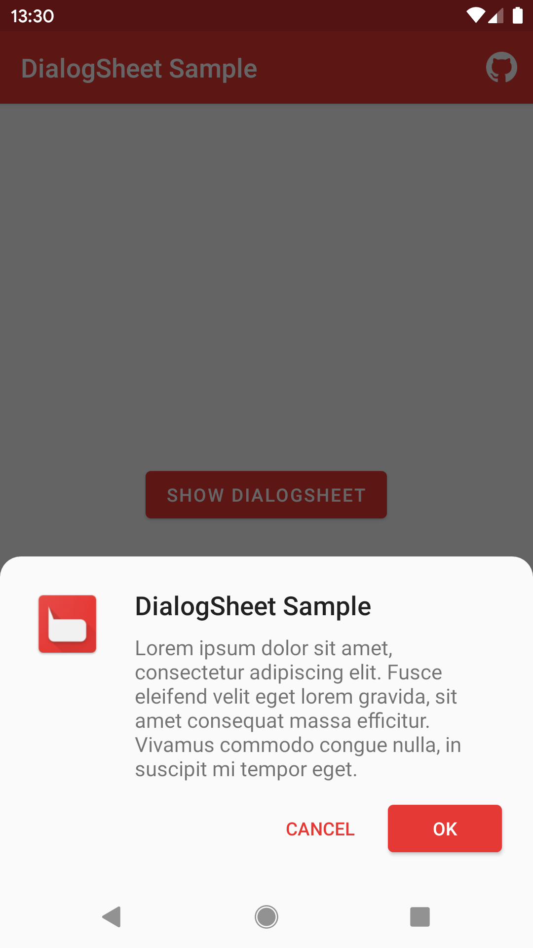
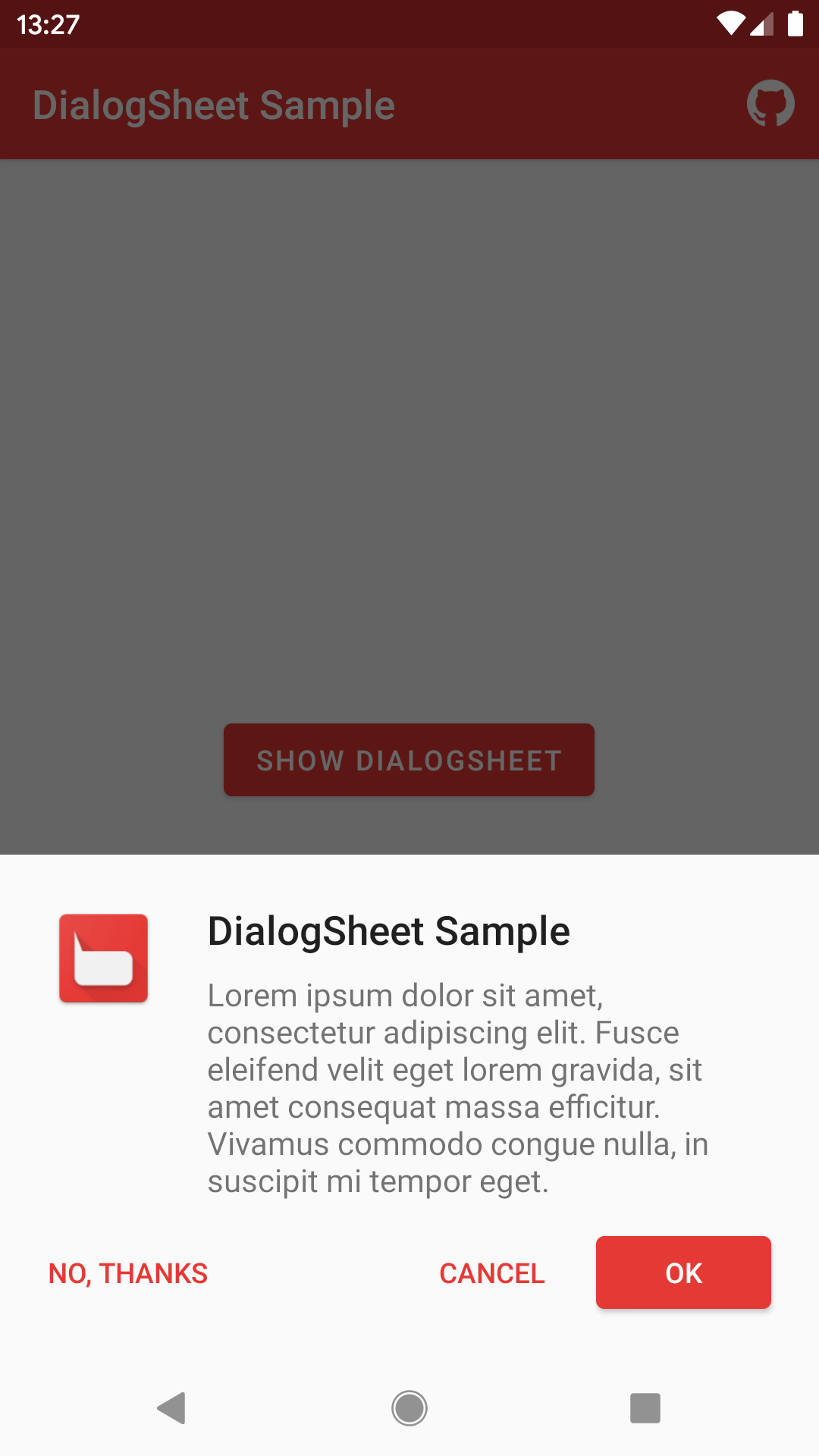
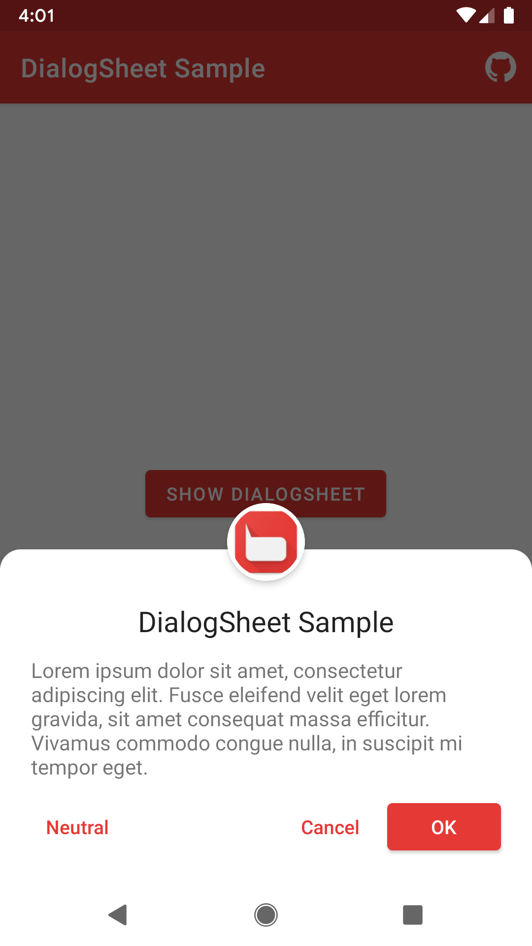
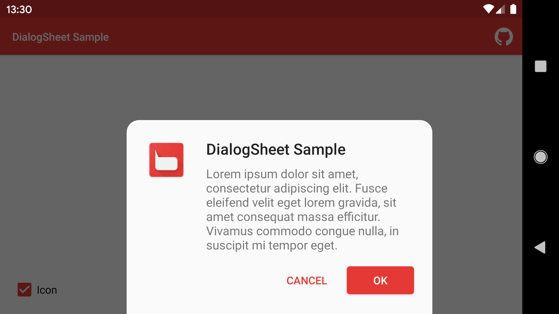
An Android library to create fully material designed bottom dialogs similar to the Android Pay app.
- This library is now based on Kotlin and AndroidX.
You can see all the library releases here.
Download the sample apk here.
Add this to your root build.gradle file:
allprojects {
    repositories {
        ...
        maven { url 'https://jitpack.io' }
    }
}
Now add the dependency to your app build.gradle file:
implementation 'com.github.marcoscgdev:DialogSheet:2.1.1'
Here is a complete snippet of it usage:
val dialogSheet = DialogSheet(this)
    .setTitle(R.string.app_name)
    .setMessage(R.string.lorem)
    .setColoredNavigationBar(true)
    .setTitleTextSize(20) // In SP
    .setCancelable(false)
    .setPositiveButton(android.R.string.ok) {
        // Your action
    }
    .setNegativeButton(android.R.string.cancel) {
        // Your action
    }
    .setNeutralButton("Neutral")
    .setRoundedCorners(false) // Default value is true
    .setBackgroundColor(Color.BLACK) // Your custom background color
    .setButtonsColorRes(R.color.colorAccent) // You can use dialogSheetAccent style attribute instead
    .setNeutralButtonColor(Color.WHITE)
.show()Simply add a new boolean-type argument to the dialog constructor.
val dialogSheet = DialogSheet(this, true)
    ...
    ...
.show()You can do it programmatically
.setButtonsColorRes(R.color.colorPrimary).setPositiveButtonColorRes(R.color.colorPrimary)
.setNegativeButtonColorRes(R.color.colorNegative)
.setNeutralButtonColorRes(R.color.colorNeutral)Or by adding this atribute to your main app theme
<item name="dialogSheetAccent">@color/colorAccent</item>Simply override this dimen with your desired size
<dimen name="dialog_sheet_corner_radius">16dp</dimen>- Via inflated view:
View view = View.inflate(context, R.layout.custom_dialog_view, null);
dialogSheet.setView(view);- Via layout resource:
dialogSheet.setView(R.layout.custom_dialog_view);

// Access dialog custom inflated view
View inflatedView = dialogSheet.getInflatedView();
Button button = (Button) inflatedView.findViewById(R.id.customButton);
...
See the sample project to clarify any queries you may have.
The MIT License (MIT)

Copyright (c) 2017 Marcos Calvo García

Permission is hereby granted, free of charge, to any person obtaining a copy
of this software and associated documentation files (the "Software"), to deal
in the Software without restriction, including without limitation the rights
to use, copy, modify, merge, publish, distribute, sublicense, and/or sell
copies of the Software, and to permit persons to whom the Software is
furnished to do so, subject to the following conditions:

The above copyright notice and this permission notice shall be included in all
copies or substantial portions of the Software.

THE SOFTWARE IS PROVIDED "AS IS", WITHOUT WARRANTY OF ANY KIND, EXPRESS OR
IMPLIED, INCLUDING BUT NOT LIMITED TO THE WARRANTIES OF MERCHANTABILITY,
FITNESS FOR A PARTICULAR PURPOSE AND NONINFRINGEMENT. IN NO EVENT SHALL THE
AUTHORS OR COPYRIGHT HOLDERS BE LIABLE FOR ANY CLAIM, DAMAGES OR OTHER
LIABILITY, WHETHER IN AN ACTION OF CONTRACT, TORT OR OTHERWISE, ARISING FROM,
OUT OF OR IN CONNECTION WITH THE SOFTWARE OR THE USE OR OTHER DEALINGS IN THE
SOFTWARE.


