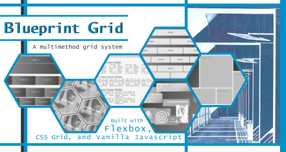
Blueprint Grid is a multi-method CSS and javascript library for creating responsive or dynamic layouts for mobile apps and websites. It is free and open source under the MIT license.
Blueprint Grid is the layout component for Brutalist Framework.
Built with:
- Flexbox CSS
- CSS grid
- Vanilla javascript
There are five methods for creating layouts:
- B3Grid: Blocks and Bricks Base Grid (Flexbox-based)
- CSS grid: auto-adjusting layouts based on CSS grid
- Print Grid: paper-friendly print grid
- Bento Grid: dynamic auto-fill layout grid
- Chaos Grid: anti-grid grid with (optional) random positioning
- PolyGrids: experimental grids with multiple dimensions
You will need:
- /source/blueprintgrid.css
- /source/methods/js/bento-grid.js (if using Bento Grid method)
- /source/methods/js/chaos-grid.js (if using Chaos Grid method)
The blueprintgrid.css file will import all the grid method CSS files from the /source/methods directory, which contains the following method CSS source files:
- b3grid.css
- bento-grid.css
- bootstrap-grid.css
- chaos-grid.css
- css-grid.css
- media-queries.css
- polygrids.css
- print-grid.css
- variables.css
The above files can be referenced independently. The CSS variables file is imported into each of the other files, EXCEPT FOR media-queries and bootstrap-grid.
You can find detailed documentation in the Blueprint Grid Wiki.
You can see live demos at: BlueprintGrid.com.
