Alerts Architecture
The alerts architecture is designed to implement a highly customizable alert that displays a message to the user. The system encapsulates a layout controller responsible for positioning the alert, a stack controller that keeps track of the visible alert and a masking view backing the alert to prevent accidental clicks outside the alert.
Please refer to the following diagram of components included in the alerts system:

The DUXBetaAlertLayoutController is responsible for controlling the position of the alert view on screen, it holds a reference to the visible alert. It's able to intercept keyboard shown/hidden notifications triggered by user interaction with any custom text field views presented by the alert.
The DUXBetaAlertStackController keeps track of the visible alerts currently displayed on screen. It keeps track of the top-most alert so it can return a reference to it. It also makes sure that the same alert is not presented twice.
The DUXBetaAlertViewMask is a specialized subclass of UIView that acts as the background view of the alert. It fills the screen in order to intercept the user's interaction with the content still visible outside the alert's frame. This control's background color can be easily customized through the alert view appearance instance and it also controls if the alert should disappear when the user taps outside the alert. This is the default behavior, but it can easily be turned off through customization.
The DUXBetaAlertAction is a specialized subclass of a UIButton that encapsulates an action button displayed as an alert. The action object provides the button text and the action to be performed when that button is tapped, along with customization properties that are defined as an instance of DUXBetaAlertActionAppearance.
Use the diagram below as a reference for the following section:
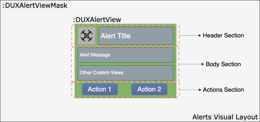
The DUXBetaAlertView implementation has been designed to provide by default an icon image view and a title label which define the header section. The body section contains by default a message container. The action section is an empty container that is dynamically populated on create.
Each section is defined by its own stack view container and all the sections are organized as arranged subviews of general scroll view instance. All the major stack view properties are customizable through the DUXBetaAlertViewAppearance implementation.
The body section layout can easily be extended to include other visual elements by adding these elements as subviews of the var customizedView: UIView? property. This can be done either from a specialized alert subclass or when simply instantiating the standard implementation of an alert.
The final height of the alert gets computed and set programmatically based on the actual content being displayed.
An alert control can be instantiated from code directly like this:
let alert = DUXBetaAlertView()
alert.titleText = "Sample Title"
alert.message = "Alert sample description."
alert.image = .duxbeta_image(withAssetNamed: "WarningIcon")
alert.appearance.imageTintColor = .duxbeta_alertWarning()

let okAction = DUXBetaAlertAction.action(actionTitle: "OK", style: .default, actionType: .closure, completionAction: {
    // Perform any operations on OK
})
alert.add(okAction)

let cancelAction = DUXBetaAlertAction.action(actionTitle: "Cancel", style: .cancel, actionType: .closure, completionAction: {
    // Perform any operations on Cancel
})
alert.add(cancelAction)

alert.show {
    // Perform any operations after the alert is visible
}DUXBetaAlertView *alert = [[DUXBetaAlertView alloc] init];
alert.titleText = @"Sample Title";
alert.message = @"Alert sample description.";
alert.image = [UIImage duxbeta_imageWithAssetNamed:@"WarningIcon"];
alert.appearance.imageTintColor = [UIColor duxbeta_alertWarningColor];
DUXBetaAlertAction *okAction = [DUXBetaAlertAction actionWithActionTitle:@"OK"
style:UIAlertActionStyleDefault
actionType:DUXBetaAlertActionTypeClosure
target:nil
selector:nil
completionAction:^{
// Perform any operations on OK
}];
[alert add:okAction];
DUXBetaAlertAction *cancelAction = [DUXBetaAlertAction actionWithActionTitle:@"Cancel"
style:UIAlertActionStyleCancel
actionType:DUXBetaAlertActionTypeClosure
target:nil
selector:nil
completionAction:^{
// Perform any operations on Cancel
}];
[alert add:cancelAction];
[alert showWithCompletion: ^{
// Perform any operations after the alert is visible
}];The following alert is created by the sample code:

The DUXBetaAlertViewAnimation is an enum that defines the animation types which will be used when showing or closing an alert view instance. Alert view animation types are:
| Type | Description |
|---|---|
| Standard | A frame transformation that animates the scale factor from 0.1 to 1.0 when the alert is shown, and reverts it when the alert is hidden. |
| Fade | An opacity animation |
The DUXBetaAlertViewLayout is an enum that defines the possible orientations supported by the different alert view sections. Alert view layout types are:
| Type | Description |
|---|---|
| Horizontal | Defines the horizontal layout of the elements |
| Vertical | Defines the vertical layout of the elements |
List of the alert view APIs
-
public var image: UIImage?- The image to be displayed into the left side of the header. -
public var titleText: String?- The text to be displayed as a title in the header. -
public var message: String?- The text to be displayed in the details section. -
public var appearance = DUXBetaAlertViewAppearance()- The appearance structure that encloses all the customization properties. -
public var isVisible: Bool = false- Indicates if the alert view is visible. -
public var shouldHideOnTap: Bool = false- Indicates if the alert view should hide when tapping outside the alert,falseby default. -
public var customizedView: UIView?- Customizable view that will be added under the message. -
public var centerXConstraint: NSLayoutConstraint?- The X center constraint of the alert. -
public var centerYConstraint: NSLayoutConstraint?- The Y center constraint of the alert. -
public let stackController = DUXBetaAlertStackController.defaultStack- The stack controller that keeps track of the visible alerts currently displayed on screen. It uses the singleton instance acquired by callingdefaultStack. -
public let layoutController- The layout controller responsible for managing the position of the alert. -
public var maskView- The mask view placed under the current alert view. -
public var dismissCompletion: (() -> ())?- The callback invoked when the alert is dismissed by tapping outside its content.
List of the alert view customization APIs
-
@objc public var imageTintColor: UIColor?- The tint color for the image icon. -
@objc public var titleFont: UIFont? = .boldSystemFont(ofSize: 17.0)- The font to be used for the title text,17.0font size by default. -
@objc public var titleColor: UIColor? = .duxbeta_white()- The color to be used for the title text,whiteby default. -
@objc public var titleTextAlignment: NSTextAlignment = .left- The alignment to be used for the title text,leftaligned by default. -
@objc public var titleBackgroundColor: UIColor? = .duxbeta_clear()- The color to be used for the title background,clearby default. -
@objc public var messageFont: UIFont? = .systemFont(ofSize: 15.0)- The font to be used for the details,15.0font size by default. -
@objc public var messageColor: UIColor? = .duxbeta_white()- The color to be used for the details text,whiteby default. -
@objc public var messageTextAlignment: NSTextAlignment = .left- The alignment to be used for the details text,leftaligned by default. -
@objc public var messageBackgroundColor: UIColor? = .duxbeta_clear()- The color to be used for the details background,clearby default. -
@objc public var bodyLayoutSpacing: CGFloat = 2.0- The spacing between the message text and any custom view, if one is available,2.0by default. -
@objc public var maskViewColor: UIColor? = .duxbeta_alertViewMask()- The color to be used for the alert mask view container. -
@objc public var borderCornerRadius: CGFloat = 0.0- The border corner radius for the alert view container,0.0by default. -
@objc public var borderWidth: CGFloat = 0.0- The border width for the alert view container,0.0by default. -
@objc public var borderColor: UIColor?- The border color for the alert view container. -
@objc public var backgroundColor: UIColor = .duxbeta_alertBackground()- The background color for the alert view container. -
@objc public var verticalOffset: CGFloat = 20.0- The top and bottom vertical offset of the view,20.0by default. -
@objc public var horizontalOffset: CGFloat = 10.0- The left and right horizontal offsets of the view,10.0by default. -
@objc public var animationType: DUXBetaAlertViewAnimation = .standard- Show/hide animation type,standardby default. -
@objc public var animationDuration: Double = 0.3- Show/hide animation duration in seconds,0.3by default. -
@objc public var headerLayoutType: DUXBetaAlertViewLayout = .horizontal- The layout type of the header components: the image icon and the title,horizontalby default. -
@objc public var headerLayoutSpacing: CGFloat = 2.0- The spacing between the header components: the image icon and the title,2.0by default. -
@objc public var actionsLayoutType: DUXBetaAlertViewLayout = .horizontal- The layout type of the alerts actions,horizontalby default. -
@objc public var actionLayoutSpacing: CGFloat = 2.0- The spacing between the action buttons,2.0by default. -
@objc public var alertLayoutSpacing: CGFloat = 10.0- The spacing between the header, body and action containers,10.0by default. -
@objc public var shouldDismissOnTap: Bool = true- The boolean value that controls if the alert view should close when tapping outside the alert,trueby default.
List of the alert action APIs
-
@objc public var style: UIAlertAction.Style = .default- The style that is applied to the action,defaultby default. -
@objc public var appearance: DUXBetaAlertActionAppearance- The appearance object that encloses all the customization properties. -
@objc public var action: DUXBetaAlertActionCompletionBlock?- The completion block that gets called on button tap. -
@objc public var actionType = DUXBetaAlertActionType.none- The action type applied to the alert action,noneby default. -
@objc public var actionTitle: String?- The title to be used as the button title. -
@objc public var target: AnyObject?- The target instance that gets used on button tap. -
@objc public var selector: Selector?- The selector that gets called on button tap.
List of the alert action customization APIs
-
@objc public var actionFont = UIFont.systemFont(ofSize: 17.0)- The font to used for the button text,17.0by default. -
@objc public var actionColor = UIColor.duxbeta_alertActionBlue()- The color to be used for the button text. -
@objc public var actionBorderColor: UIColor?- The border color to be used for the button. -
@objc public var actionBorderWidth: CGFloat = 0.0- The border width to be used for the button,0.0by default. -
@objc public var actionCornerRadius: CGFloat = 0.0- The corner radius to be used for the button,0.0by default. -
@objc public var actionBackgroundColor: UIColor?- The background color to be used for the button. -
@objc public var actionNormalBackgroundImage: UIImage?- The background image to be used for the button in normal state. -
@objc public var actionSelectedBackgroundImage: UIImage?- The background image to be used for the button in selected state.
The following customization can be achieved with the code sample below:

alert.image = .duxbeta_image(withAssetNamed: "ErrorIcon")
alert.appearance.imageTintColor = .duxbeta_danger()
alert.appearance.titleColor = .duxbeta_black()
alert.appearance.backgroundColor = .duxbeta_lightGray()
let actionAppearance = DUXBetaAlertAction.DUXBetaAlertActionAppearance()
actionAppearance.actionColor = .duxbeta_black()
okAction.appearance = actionAppearance
cancelAction.appearance = actionAppearancealert.image = [UIImage duxbeta_imageWithAssetNamed:@"ErrorIcon"];
alert.appearance.imageTintColor = [UIColor duxbeta_dangerColor];
alert.appearance.titleColor = [UIColor duxbeta_blackColor];
alert.appearance.backgroundColor = [UIColor duxbeta_lightGrayColor];
DUXBetaAlertActionAppearance *actionAppearance = [[DUXBetaAlertActionAppearance alloc] init];
actionAppearance.actionColor = [UIColor duxbeta_blackColor];
okAction.appearance = actionAppearance;
cancelAction.appearance = actionAppearance;You can find below an example of an alert containing a custom text field view displayed in the body section:

let inputField = UITextField()
inputField.layer.borderWidth = 0.5
inputField.layer.borderColor = UIColor.duxbeta_black().cgColor
inputField.font = .systemFont(ofSize: 14)
inputField.placeholder = "Sample Input Field"
alert.customizedView = inputFieldUITextField *inputField = [[UITextField alloc] init];
inputField.layer.borderWidth = 0.5;
inputField.layer.borderColor = [UIColor duxbeta_blackColor].CGColor;
inputField.font = [UIFont systemFontOfSize:14];
inputField.placeholder = @"Sample Input Field";
alert.customizedView = inputField;Existing widgets that already use these alerts are: