List Item Edit Text Button Widget
The widget is an extension of the List Item Title Widget. The primary purpose of this widget is to accept inputs from user and enable user interaction.
override init() {
    super.init(.onlyEdit)
    // Instantiate other variables
}

required init?(coder: NSCoder) {
    super.init(.onlyEdit)
    // Instantiate other variables
}- (instancetype)init {
if (self = [super init:DUXBetaListItemOnlyEdit]) {
// Instantiate other variables
}
return self;
}
- (instancetype)initWithCoder:(NSCoder *)coder {
if (self = [super init:DUXBetaListItemOnlyEdit]) {
// Instantiate other variables
}
return self;
}The WidgetType supports two values:

It inherits the title icon and title text and its customizations from the List Item Title Widget. Additionally it provides an edit text to enter value and a label to show hint. The widget supports all the edit text customizations and hint customizations mentioned below.
Example of the widget is Max Altitude
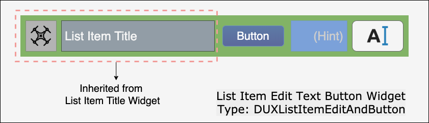
It inherits the title icon and title text and its customizations from the List Item Title Widget. Additionally it provides an edit text to enter value, a label to show hint and a button for user interaction. The widget supports all the edit text customizations, hint customizations and button customizations mentioned below.
The UI elements can be customized to match the style of the user's application. The customizations can be done programmatically using the APIs.
List of the customization APIs
-
BOOL enableEditField;- Flag indicating if the edit field is enabled. -
DUXBetaKeyBoardChangedState keyboardChangedStatusBlock;- Executable code block which will be called when the keyboard appears or disappears on screen. -
UIColor *editTextColor;- The border color for the edit text field when enabled. -
UIColor *editTextDisabledColor;- The border color for the edit text field when disabled. -
UIColor *editTextBorderColor;- The border color for the edit text field when enabled. -
UIFont *editTextFont;- The font/size to use or the edit text field. -
float editTextCornerRadius;- The corner radius for the edit text field border. -
float editTextBorderWidth;- The width of the edit text field border. -
- (void)setEditText:(NSString*)editFieldText;- Set the text in the edit text field. -
- (void)setEditFieldWidthHint:(CGFloat)editWidthHint;- Set the desired width for the edit text field. The value set here is used when initially creating the widget. -
- (void)setEditFieldWidth:(CGFloat)editWidth;- Set the desired width for the edit text field. -
- (void)setEditFieldValuesMin:(NSInteger)minValue maxValue:(NSInteger)maxValue;- Set a minimum and maximum value for the integer value of the text field. -
- (void)setTextChangedBlock:(DUXBetaTextInputChangeBlock)newBlock;- Set a custom executable block to be called when the edit text field changes.
List of the customization APIs
-
NSString *hintText;- The string value for list item hint label. -
UIColor *hintBackgroundColor;- The background color for the hint text area. -
UIColor *hintTextColor;- The color for drawing the hint text. -
UIColor *hintTextFont;- The font/size of the hint text. -
- (void)setHintText:(NSString*)hintText;- Replace any current hint text with the new hint text next to the edit text field.
List of the customization APIs
-
BOOL buttonEnabled;- Flag indicating if the action button is enabled. -
UIFont *buttonFont;- The font/size to draw the button label for sub-classes with buttons. -
float buttonBorderWidth;- The width of the button border for sub-classes with buttons. -
float buttonCornerRadius;- The curvature radius for the border put on the buttons or controls for sub-classes with controls. -
- (UIColor *)normalColor;- The color to use for drawing items in a normal state. This method can be overridden by the sub-class. -
- (UIColor *)disabledColor;- The color to use for drawing items in a disabled state. This method can be overridden by the sub-class. -
- (UIColor *)warningColor;- The color to use for drawing items in a warning state. This method can be overridden by the sub-class. -
- (UIColor *)buttonBorderNormalColor;- The color to use for drawing button border color in a normal state. This method can be overridden by the sub-class. -
- (UIColor *)buttonBorderDisabledColor;- The color to use for drawing button border color in a disabled state. This method can be overridden by the sub-class. -
- (UIColor *)buttonBorderSelectedColor;- The color to use for drawing button border color in a selected state. This method can be overridden by the sub-class. -
- (UIColor *)buttonBorderSelectedColor;- The color to use for drawing button border color in a selected state. This method can be overridden by the sub-class. -
- (BOOL)forceAspectRatio;- Override forceAspectRatio if the subclass needs to be presented in a hard aspect ratio instead of being able to expand and contract horizontally. -
- (void)setButtonColor:(UIColor *)buttonColor forUIControlState:(UIControlState)controlState;- Set the color for drawing any subclass button for the given control state. -
- (UIColor *)getButtonColorForUIControlState:(UIControlState)controlState;- Get the color for drawing any subclass button for the given control state. -
- (void)setButtonBorderColor:(UIColor *)buttonColor forUIControlState:(UIControlState)controlState;- Set the color for drawing any subclass button border for the given control state. -
- (UIColor *)getButtonBorderColorForUIControlState:(UIControlState)controlState;- Get the color for drawing any subclass button border for the given control state. -
- (void)setButtonBackgroundColor:(UIColor *)buttonBackgroundColor forUIControlState:(UIControlState)controlState;- Set the color for drawing the button background fill of any subclass button for the given control state. -
- (UIColor *)getButtonBackgroundColorForUIControlState:(UIControlState)controlState;- Get the color for filling the background of any subclass button for the given controlState.
The widget provides hooks for users to add functionality based on state changes in the widget.
The List Item Edit text widget provides the following hooks:
-
ListItemEditTextModelState- Provides hooks in events received by the widget from the user interface interactions. It inherits ListItemTitleModelState and it adds no other hooks. -
ListItemEditTextUIState- Provides hooks in events received by the widget from the user interface interactions. It inherits ListItemTitleUIState and it adds the following hooks:
-
+ (instancetype)editStarted;- Event sent when the edit is starting. Always sends YES/true. -
+ (instancetype)editFinished;- Event sent when the edit is ending. Always sends YES/true. -
+ (instancetype)buttonTapped;- Event sent when the button is tapped. Always sends YES/true.